The Best Paint Colors for a Calm Home
There is something quietly powerful about walking into a room that instantly makes your shoulders drop and your breath slow. Often, it is not the furniture or the décor that creates this feeling—it is the color on the walls. Paint has a subtle yet profound influence on mood, energy, and emotional balance. When chosen with intention, the right shades can transform a busy house into a calm retreat.
Whether you live in a small apartment or a spacious home, creating a peaceful atmosphere starts with color. Let us explore the best paint colors for a calm home, why they work, and how to use them beautifully in real life.
Key Points at the Beginning
- Paint color directly affects mood, stress levels, and emotional comfort.
- Soft neutrals, gentle blues, muted greens, and warm earthy tones promote calm.
- Lighting plays a major role in how calming a color feels.
- Different rooms benefit from different soothing shades.
- You can create a calm home even with bold colors by using proper balance.
Why Paint Color Affects Emotional Wellbeing
Color psychology is not just decorative theory—it reflects how the human nervous system responds to light and shade. Soft, low-contrast colors signal safety and rest to the brain. Harsh or overly bright tones stimulate alertness and mental activity.
In a calm home, the goal is not to eliminate energy but to soften visual stimulation. Gentle hues help:
- lower mental fatigue
- reduce visual noise
- support relaxation
- create emotional steadiness
- improve sleep and focus
Your walls quietly speak to your nervous system every day.
The Philosophy of a Calm Color Palette
A calm home does not mean boring or cold. It means balanced, grounded, and visually breathable. Calm palettes usually share five traits:
- low to medium saturation
- soft undertones
- natural inspiration
- smooth contrast
- gentle transitions between rooms
This creates a seamless emotional rhythm as you move through your space.
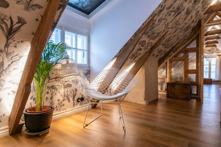
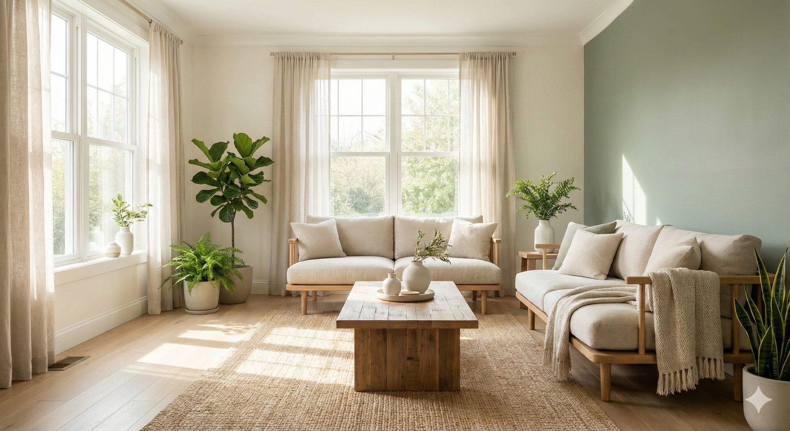
Soft White and Cream for Subtle Serenity
Not all white is the same. Warm whites and soft creams are among the most calming colors when chosen correctly.
They work because:
- they reflect natural light gently
- they create openness without sterility
- they pair beautifully with wood and natural textures
- they reduce visual clutter
- they adapt easily to any décor style
Best areas for use:
- living rooms
- hallways
- bedrooms
- meditation corners
Avoid ultra-bright clinical whites, which can feel cold rather than calm.
Gentle Beige and Warm Neutrals
Beige, taupe, greige, and sand-inspired neutrals offer warmth without heaviness. These colors feel grounded and emotionally soothing.
Why they work so well:
- they echo natural earth tones
- they feel stable and comforting
- they reduce visual sharpness
- they support cozy atmospheres
- they age well over time
These shades are excellent for:
- open-concept living spaces
- family rooms
- reading nooks
- quiet workspaces
Soft Blue for Mental Quiet and Rest
Blue has long been associated with peace, rest, and trust. Soft, muted blues are especially effective in creating calm environments.
Calming effects of soft blue:
- slows mental activity
- supports better sleep
- lowers stress perception
- enhances clarity without stimulation
Ideal spaces:
- bedrooms
- bathrooms
- home offices
- guest rooms
Pale sky blue, powder blue, and misty blue tones feel especially peaceful.
Muted Green for Balance and Emotional Ease
Green sits at the center of the color spectrum, making it one of the most naturally restful colors for the human eye. Muted sage, olive, and eucalyptus greens bring nature indoors.
Benefits of calming green tones:
- emotional balance
- gentle rejuvenation
- visual rest
- grounding energy
Perfect for:
- living rooms
- kitchens
- bedrooms
- indoor plant corners
Green pairs beautifully with wood, linen, and natural stone.
Dusty Pastels for Soft Emotional Energy
Pastels do not have to feel childish. When muted and dusty, they feel airy and gentle.
Examples include:
- dusty lavender
- soft blush
- muted peach
- pale clay
These shades work well for:
- reading rooms
- nurseries
- creative studios
- dressing rooms
They add subtle warmth without overwhelming the senses.
Warm Gray for Modern Calm
Warm gray offers a modern alternative to beige without the coldness of traditional gray. It creates a quiet, supportive backdrop.
Warm gray supports:
- minimal visual distraction
- modern calm aesthetics
- balance between cool and warm elements
- compatibility with most furniture styles
Avoid blue-based grays, which can feel chilly rather than calm.
Earth-Inspired Colors for Deep Grounding
Colors borrowed from nature often feel instinctively calming.
These include:
- clay
- stone
- sand
- soft terracotta
- mushroom brown
These shades promote:
- emotional safety
- warmth
- stability
- connection with nature
They are excellent for:
- dining rooms
- entryways
- bedrooms
- quiet sitting rooms
Room-by-Room Calm Color Guidance
Each room serves a different emotional purpose. Matching paint to function enhances calm naturally.
- Bedrooms: soft blue, warm white, muted green
- Living rooms: beige, warm gray, sage, cream
- Kitchens: light greige, pale green, warm white
- Bathrooms: powder blue, soft aqua, pale gray
- Home offices: muted green, warm neutral, dusty blue
This approach supports emotional flow without strict design rules.
How Lighting Changes the Feeling of Paint
Lighting can make the same color feel peaceful or harsh.
Key lighting influences:
- natural north light cools colors
- south light warms colors
- artificial warm bulbs soften tones
- cool bulbs sharpen contrasts
Always test paint samples at different times of day before committing.
Common Mistakes That Disrupt a Calm Color Scheme
Calm homes sometimes become busy unintentionally. Common issues include:
- using too many contrasting colors
- choosing overly saturated shades
- ignoring undertones
- forgetting how lighting affects mood
- mixing too many bold accent walls
Calm design thrives on restraint.
How to Use Accent Colors Without Losing Calm
Accent colors can exist in a calm home when used gently.
Try:
- one soft accent wall only
- low-saturation tones
- natural textures instead of strong colors
- colored décor instead of painted walls
Balance preserves emotional quiet.
Table Summary: Best Paint Colors for a Calm Home
| Color Family | Emotional Effect | Best Rooms |
|---|---|---|
| Soft white and cream | Openness, lightness | Living room, bedroom |
| Beige and warm neutrals | Comfort, warmth | Family room, hallways |
| Soft blue | Mental quiet, sleep support | Bedrooms, bathrooms |
| Muted green | Balance, grounding | Living room, kitchen |
| Dusty pastels | Gentle warmth | Nursery, creative spaces |
| Warm gray | Modern serenity | Offices, open areas |
| Earth tones | Deep grounding | Bedroom, entryway |
How Calm Colors Support Sleep, Focus, and Emotional Health
Calming paint colors reduce sensory overload. Over time, many homeowners notice:
- improved sleep quality
- less visual fatigue
- better concentration
- easier emotional regulation
- a subtle but steady sense of peace
Your home begins to work with your nervous system instead of against it.
Creating a Calm Home on a Budget
A calm home does not require luxury spending.
You can:
- repaint only one key room
- use sample sizes for testing
- focus on lighting first
- refresh with soft textiles
- use color through décor if repainting is not possible
Small shifts often create the biggest emotional change.
Calm Does Not Mean Colorless
A calm home still reflects personality. The key is harmony rather than restriction. Even bold colors can exist in calm homes when used thoughtfully and sparingly.
Calm is not a color—it is a feeling created through balance.
FAQ
What is the most calming paint color for a home?
Soft blues, muted greens, warm whites, and gentle neutrals are widely considered the most calming.
Are dark colors ever calming?
Yes. Deep earthy tones and warm charcoal can feel calming in low-light or intimate spaces when balanced properly.
Does paint really affect mood?
Yes. Color affects sensory perception and emotional response through visual stimulation.
How many colors should a calm home use?
Typically two to four coordinated tones work best for visual flow and emotional balance.
Can renters create calm with paint alternatives?
Yes. Temporary wallpaper, fabric panels, and removable decals offer calm color without permanent changes.